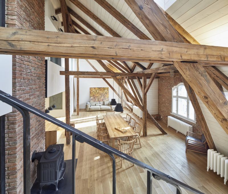
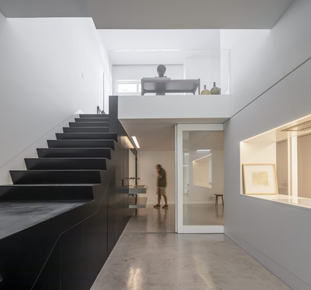
Studio apartments are one-of-a-kind spaces in which all of the living space is contained in a single room. Because these spaces are unique, it stands to reason that, when designing a studio apartment, you may need to deviate from some tried-and-true design rules.
Studio apartments necessitate creative thinking and space maximization in order to make the most of every nook and cranny in the room. Consider how breaking some of these classic interior design rules can help improve your studio or any small space.
Studio apartments vary greatly in terms of size, style, and zone separation. Some of the rules listed below will apply to your space, while others will not. The key is to look at your specific space and think outside the box to help create a design that suits your lifestyle and tastes.
Rule 1 to Break: Stick to One Design Style

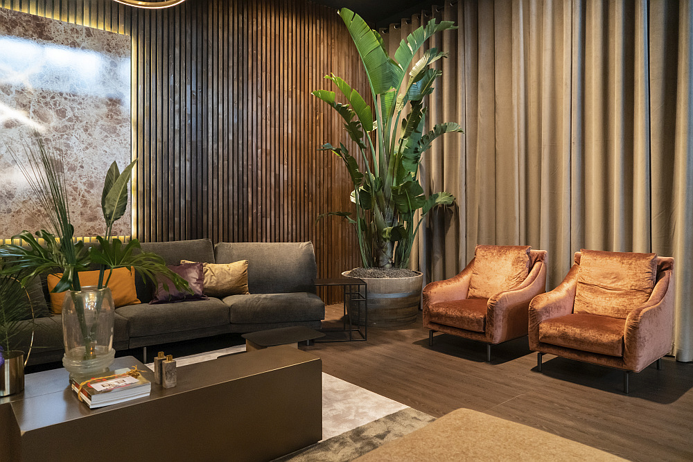
There is an understandable impulse to create cohesion in the design using a single design style because the space is interconnected. However, new approaches to design are frequently more layered and eclectic. Combining design styles can revitalize the appearance of a studio apartment and make it more reflective of your personal preferences. By mixing elements from different styles, such as modern, vintage, and industrial, you can create a dynamic interior that looks like it has a story to tell.
For example, pairing a sleek marble coffee table with a vintage sofa and ornate mirror will give your space a more layered appearance and break up the monotony that comes with a single style.
Rule 2 to Break: Use Light Colors to Make the Space Look Bigger
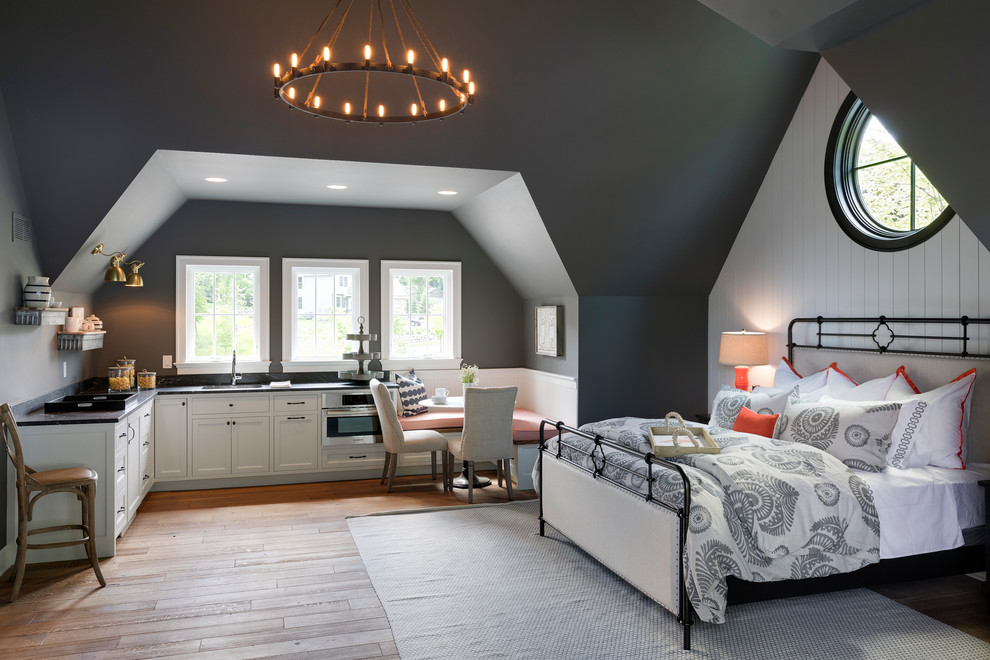
While light colors are traditionally used to make a room appear larger, dark colors can add depth, coziness, and intimacy to a studio apartment. Rich colors like navy, charcoal gray, and emerald green can elevate the look of the space and heighten its sophistication. Even if you want to paint the walls a light color or are unable to change the paint on the walls, a dark piece of furniture or decor will serve as an eye-catching focal point to help define the room’s color palette.
Rule 3 to Break: Avoid Large Furniture
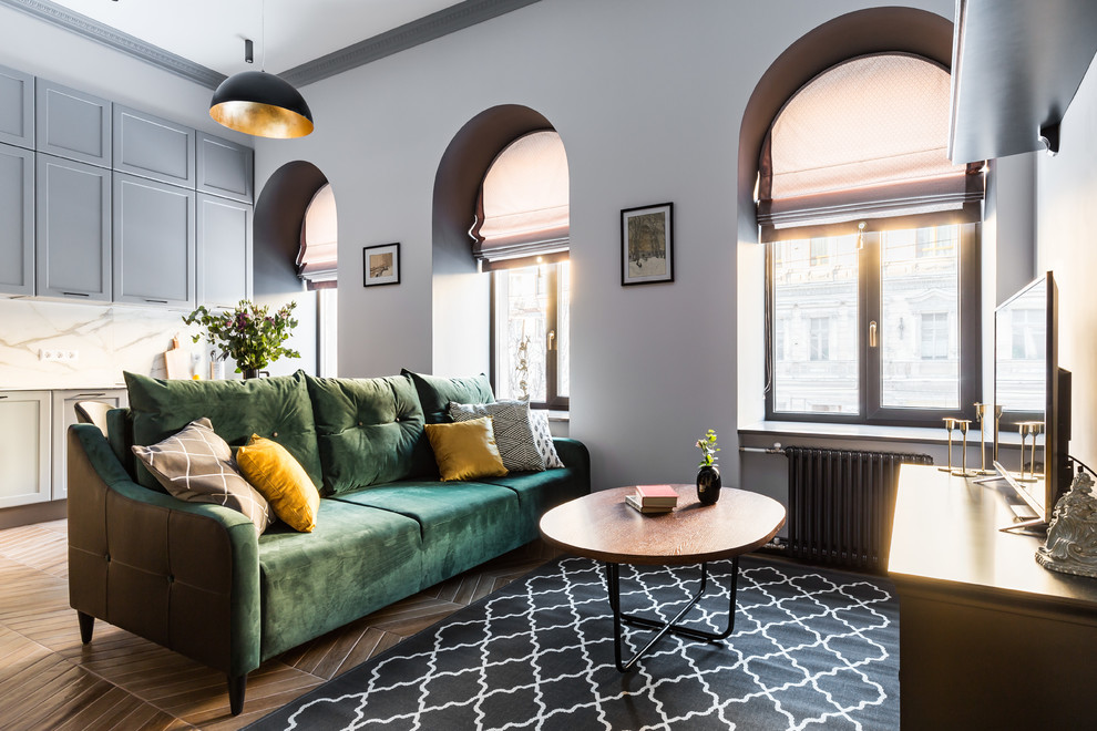
Contrary to the rules of confined spaces, incorporating one or two large statement pieces can anchor the room and add a sense of grandeur. An oversized sofa, a large piece of wall art, or a wall to wall area rug can become the focal point of the design and make the entire space feel more cohesive and intentional. These pieces can also provide greater functionality in the room by providing ample seating or by anchoring the entire space into a seamless design.
Rule 4 to Break: Keep Patterns to a Minimum
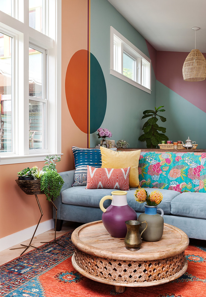
Patterns can add fun and freshness to a design, but they can also create a chaotic and visually overwhelming environment. Surprisingly, patterns can work well in small spaces. Rather than avoiding patterns or limiting them to safe areas, mixing patterns in a studio apartment in bold and deliberate ways can give your space a sense of movement and dynamism.
Stripes, florals, and abstract prints can all coexist harmoniously in the same environment. This may require some trial and error, but if you persevere, you will be able to create an enjoyable mix. Start with a statement pattern and one or two supporting designs. Pair patterns with similar colors but different scales for the most straightforward approach.
Rule 5 to Break: Maintain Symmetry
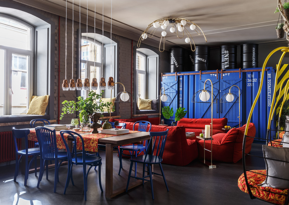
Symmetry is associated with creating a balanced and ordered environment, which can help you design a harmonious studio apartment layout. Embracing asymmetry, however, can enhance the visual appeal and dynamism of a room. Arranging furniture and decor in unusual and unexpected ways can break up the monotony of a typical layout and create distinct focal points. For example, placing a bookshelf slightly off center or hanging artwork at an unusual height will make the room feel more curated and less predictable.
Rule 6 to Break: Keep Everything Tidy and Minimal
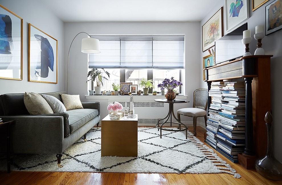
A clean space with little visible clutter will undoubtedly make your studio feel larger, but this is not always practical or necessary. Allowing a certain number of personal items on display can make a room feel more personal and warm. Displaying collections of books, plants, and other personal items that reflect your interests adds character to your home.
It can be challenging to strike the right balance between being too minimal and too cluttered. The best strategy is to include storage options that also display your personal items with greater structure. These may include open bookcases and shelves, baskets, and cabinets. These allow you to curate your items and display them neatly in such a way that they add color and textural interest to your home while also being easily accessible for use and storage.
Rule 7 to Break: Use Small Rugs in Small Rooms
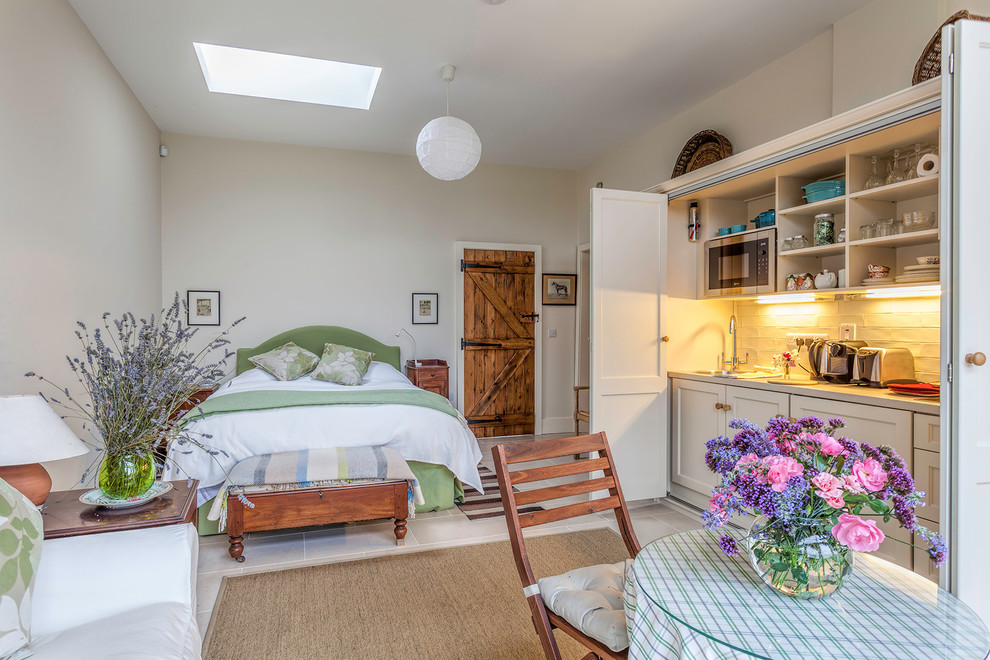
While smaller rugs might seem more appropriate for compact spaces and work well to create specific zones, larger rugs can help a studio apartment feel more cohesive and break down barriers between the living spaces. This is especially beneficial in small, open concept living spaces where many small rugs would break up the design and make it feel more cluttered.
For larger studios and those that have a higher level of zoning in the space, choose a large enough rug to comfortably fit the furniture in each distinct area.
Rule 8 to Break: Avoid Bold Art and Accessories
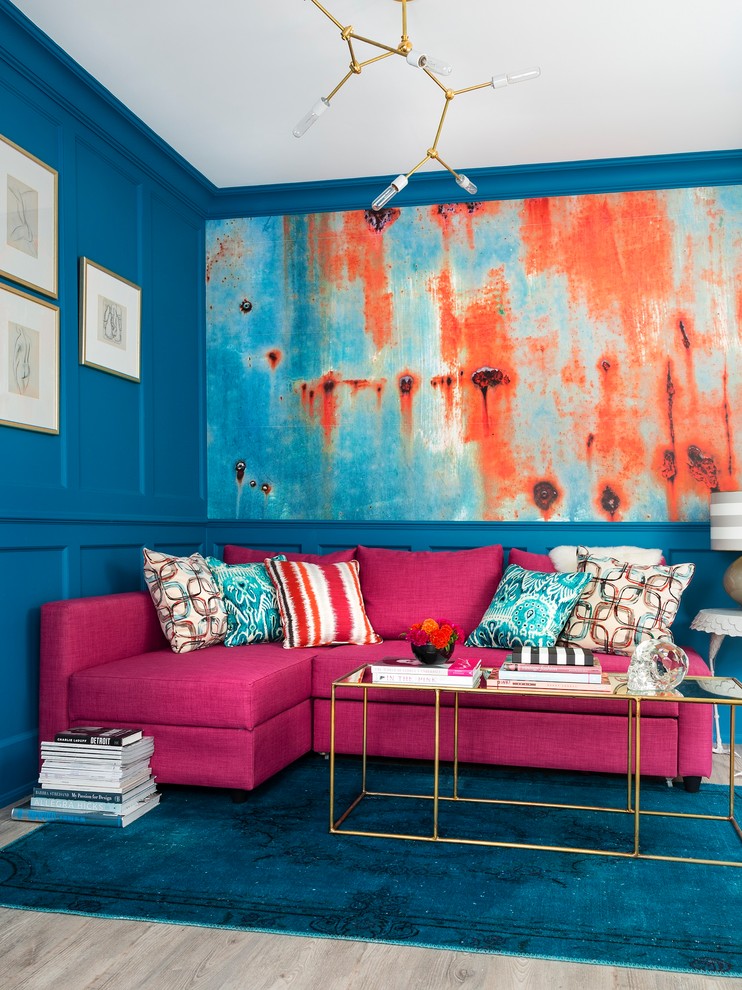
Vibrant accessories and artwork can serve to visually distract and draw attention away from a studio apartment’s small space. Large pieces of wall art, one-of-a-kind decor, and vibrant upholstery can serve as focal points in the design and add your own personality to the space.
Rule 9 to Break: Maintain Clear Boundaries Between Areas
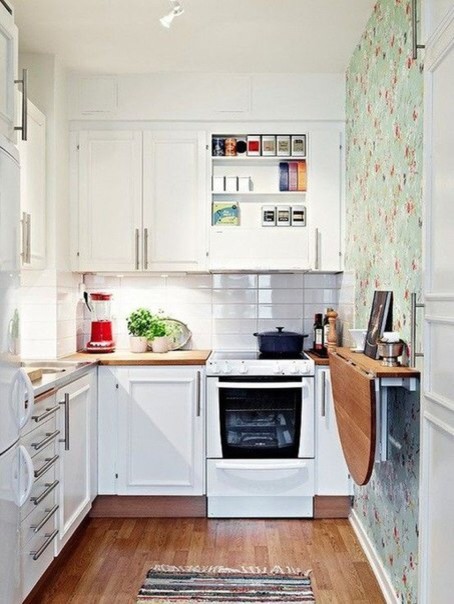
Creating distinct zones can be useful in large studio apartments. However, this strategy can be problematic in small studios where space separation makes the space feel more choppy and closed in.
Instead of drawing clear lines between your functional zones, use multi-purpose furniture to effectively blend the spaces. A dining table that doubles as a work desk and a sofa that can also be used as a bed can maximize space functionality without requiring rigid separation. The flexible approach allows you to be more creative with your space, allowing you to design a space that functions well despite its small size.
Rule 10 to Break: Avoid Too Much Furniture
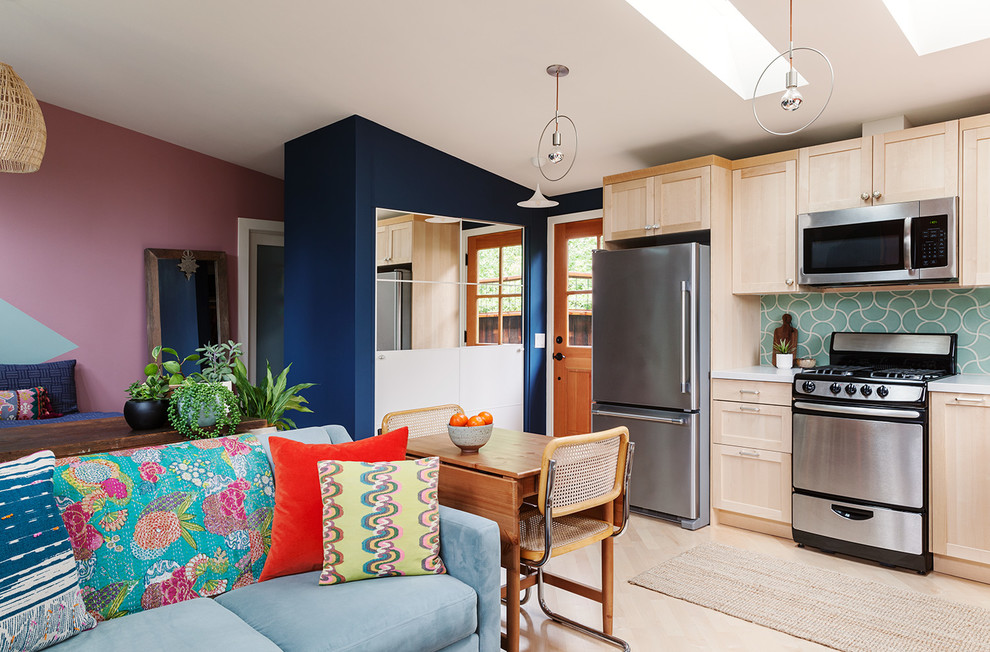
Rather than keeping your furniture to a minimum, layering your furniture in the studio can create a more open, versatile, and practical design without overcrowding it. For example, placing a desk directly behind a sofa or storing extra stools beneath your coffee table can add depth and functionality to your layout.
Rule 11 to Break: Keep the Ceilings White
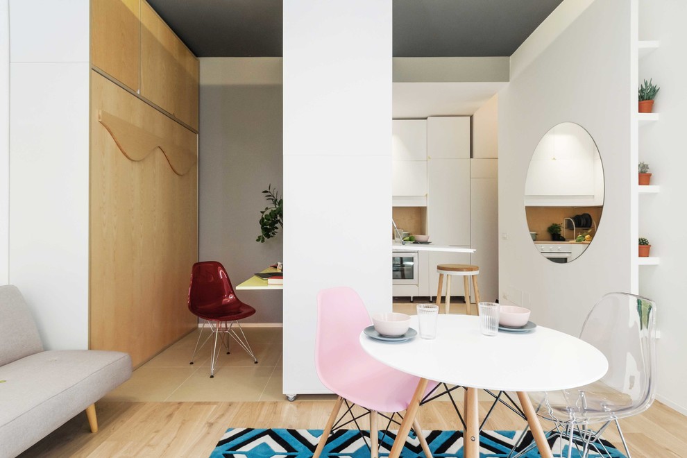
White ceilings are common in most homes and can help give a room a lighter, more airy appearance. Other colors and textures can create amazing dimension and depth in a studio apartment’s ceiling.
Paint is an easy way to add interest to ceilings. Dark colors help the ceiling recede and conceal industrial components such as wiring and plumbing. If you are not ready to tackle the entire ceiling, consider creating zones or creating faux molding elements with paint or peel-and-stick wallpaper.
Rule 12 to Break: Push the Furniture Against the Walls
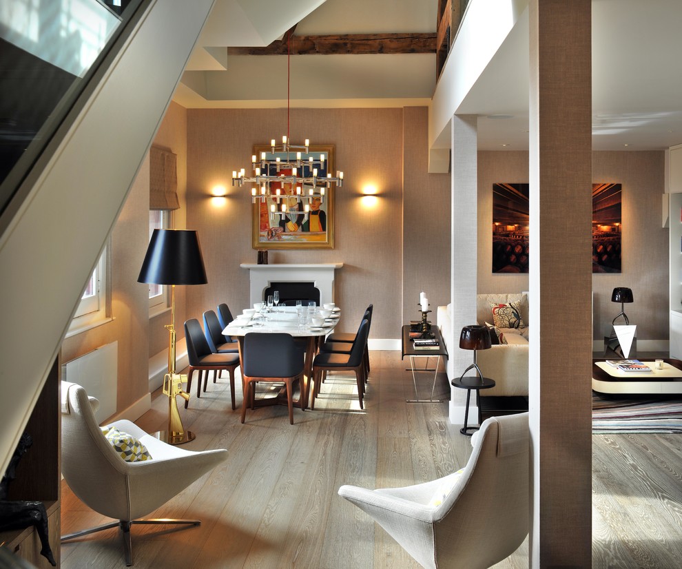
One common design strategy that is quickly becoming obsolete is to push all of your furniture against the wall to expand small spaces. This is neither practical nor necessary in studio apartments, where so much living space in the center of the room would be lost. Instead, move your furniture away from the wall, even if slightly, in all areas of the room. This will make the design appear more inviting and relaxed. Consider angling furniture or floating pieces in the center of the room to increase usable space.
The post Outdated Interior Design Rules to Break When Decorating a Studio Apartment appeared first on Homedit.


